
Digital Information Research Centre
Making innovation research accessible and discoverable
The Challenge
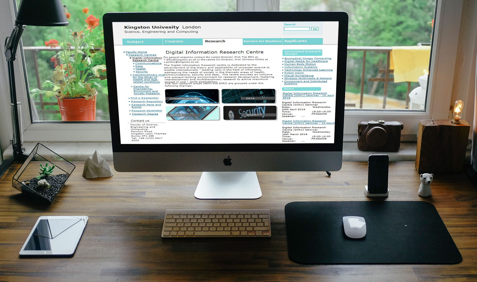
Kingston University's Faculty of Science, Engineering and Computing houses the Digital Information Research Centre—a hub showcasing cutting-edge research across science, engineering, technology, and computer science. However, the subpage dedicated to this centre wasn't serving its purpose.
I was asked to evaluate the page and propose design improvements—but with a significant constraint: I couldn't alter the overall design layout or visual system, which was governed by university-wide standards. The solution had to work within existing structural boundaries.
My Role
UX Designer and Researcher - MSc project in collaboration with Dr. Sarah Barman
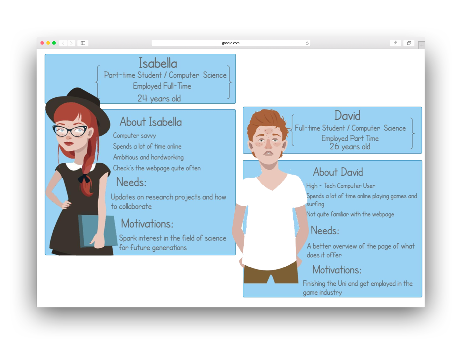
Understanding the Users
Through interviews, I identified two distinct user groups with very different needs and technical comfort levels. Creating personas helped align stakeholders on who we were designing for and what success looked like for each group.
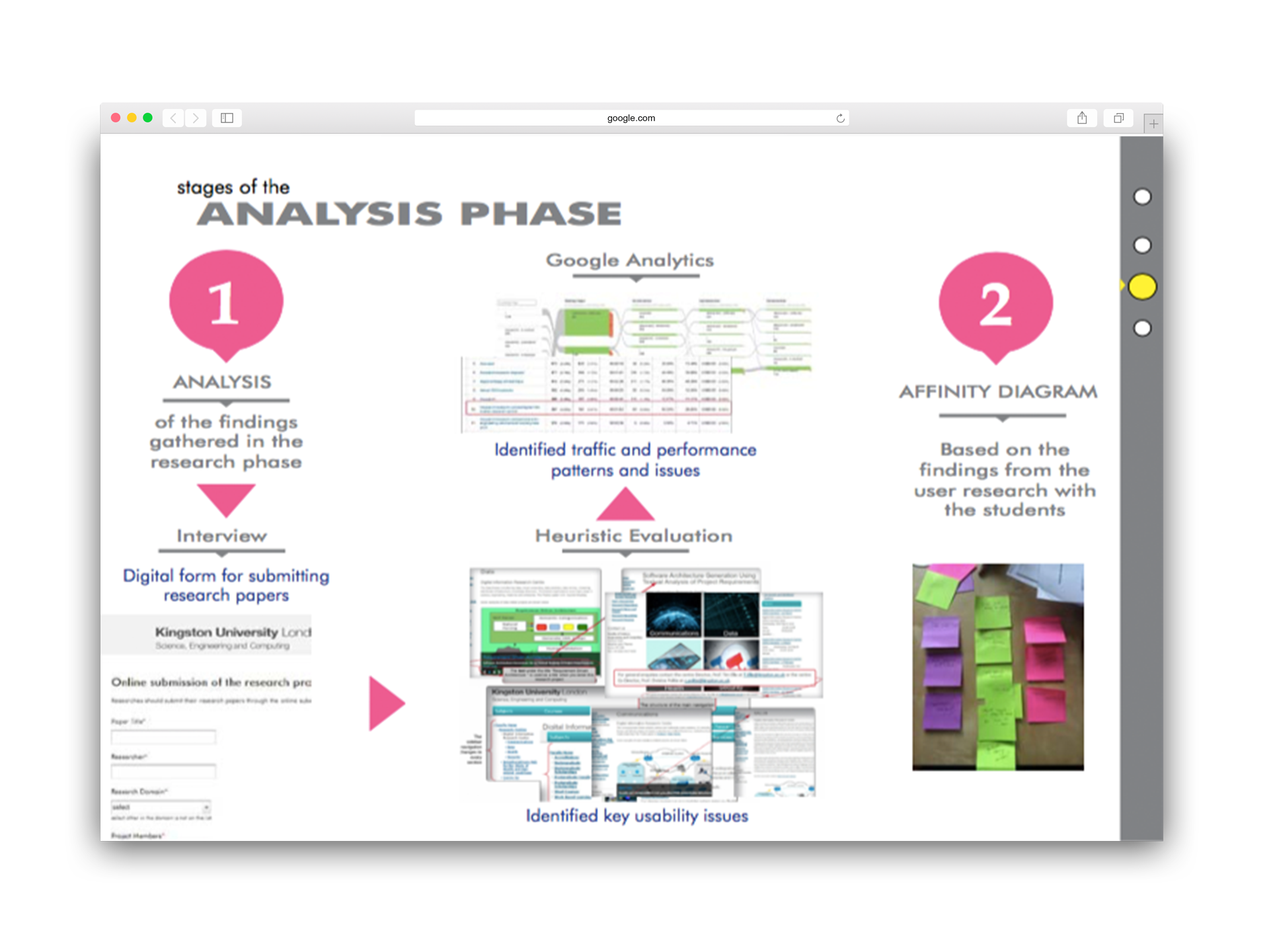
Research & Analysis
I combined multiple research methods to build a complete picture of the problem. Stakeholder interviews revealed organisational goals, heuristic evaluation uncovered usability violations, and analytics showed where users were struggling.
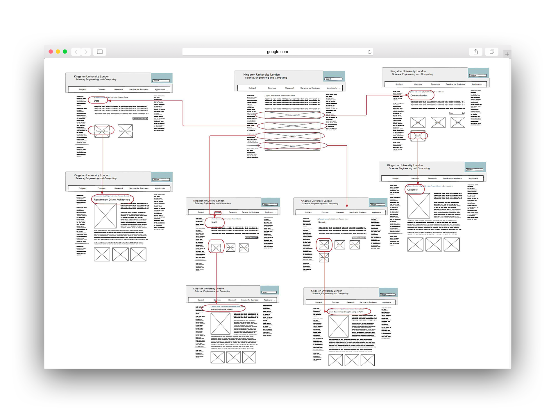
Card sorting exercises revealed the real issue: a massive mismatch between how the university organised content and how users expected to find it.
Iterating towards a solution
I explored multiple approaches to restructuring the content, testing different hierarchies and navigation patterns. Each iteration brought me closer to an organisation that matched user mental models whilst respecting the constraints I was working within.
Card sorting exercises revealed the real issue: a massive mismatch between how the university organised content and how users expected to find it.
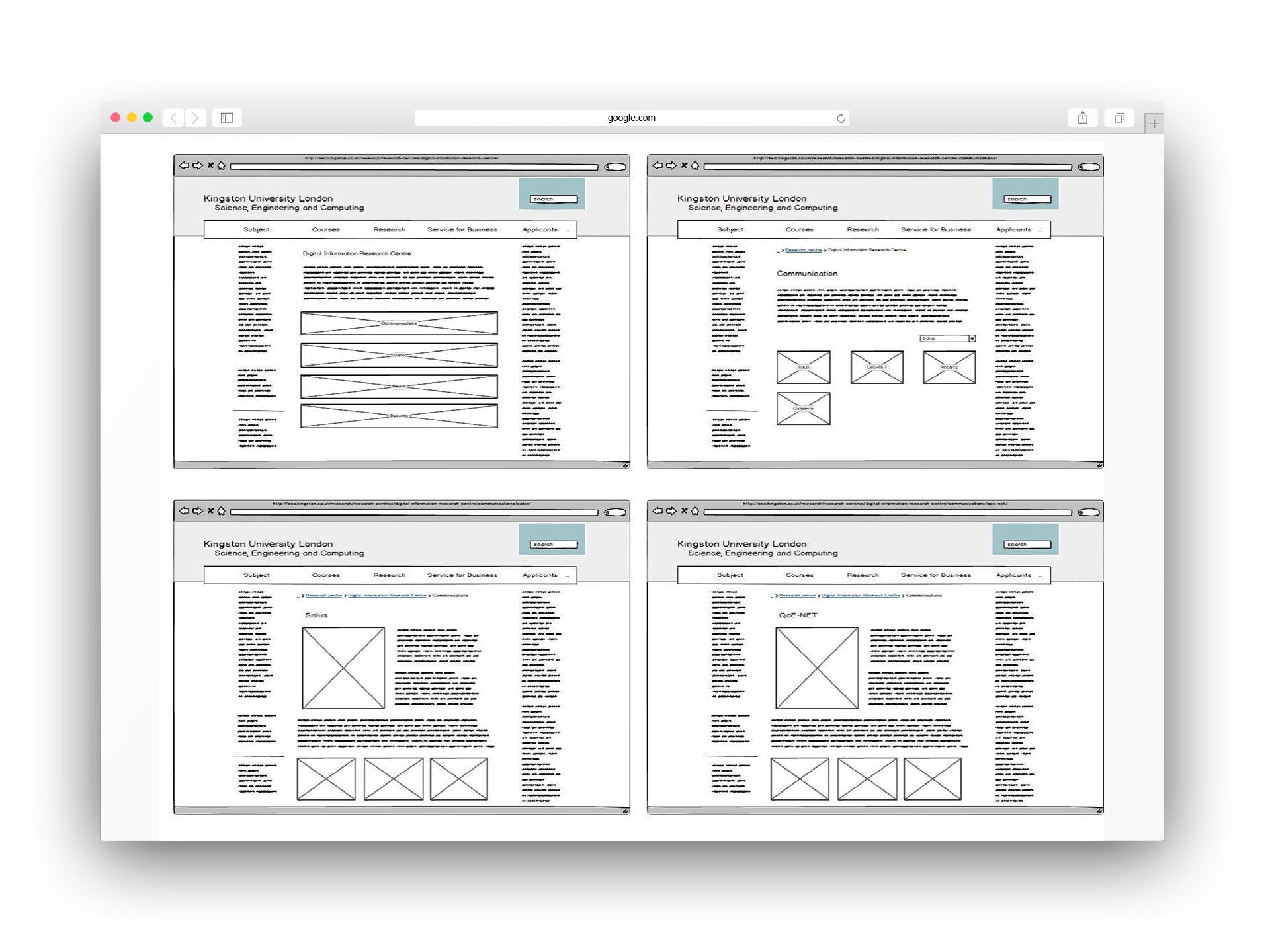
The Final Design
The restructured page prioritised discoverability and clarity. Research areas became immediately visible with clear navigation, associated research groups were prominently displayed, and upcoming events were easy to spot. The information hierarchy now matched how users actually looked for content—research themes front and centre, with supporting information logically organised around them.
Methods applied
Desk research, Heuristic evaluation, User interviews, Usability testing, Card sorting
Deliverables
UX research findings, Personas, Wireframes, Interactive prototype
Reflection
This project reinforced that constraints can sharpen focus. Unable to change the visual design, I concentrated entirely on information architecture—which turned out to be exactly what users needed.
Collaborating with Dr. Sarah Barman and university stakeholders highlighted the importance of navigating organisational complexity whilst keeping user needs central. The card sorting exercise revealed a critical insight: administrative logic rarely aligns with how people actually think and search for information.
What made this project successful was demonstrating that meaningful improvements don't always require dramatic overhauls. By restructuring existing content based on user research, we improved usability without the time and cost of a complete redesign. It reinforced the value of strategic problem-solving within real-world constraints.