Service & Digital Redesign
• Marine Sport Dive Centre •
When booking a dive felt like drowning in forms
Overview
Marine Sport DC is a dive centre located in Croatia, a country where tourism accounts for approximately 80% of the economy. In this highly competitive market, customer satisfaction and retention aren't just important—they're critical for survival. A single negative experience can ripple through tourism networks, whilst exceptional service creates loyal advocates who return year after year.
This project encompassed both service design and digital transformation, redesigning how Marine Sport DC operates in-person and online. The goal was to reduce customer churn, improve the end-to-end experience from discovery to certification, and position the dive centre as a premium choice in a saturated market.
The Challenge
In a tourism-dependent economy, every lost customer has cascading effects. Marine Sport DC was experiencing customer drop-off at multiple touchpoints: during online research, at booking, and even during the in-person dive centre experience.
How might we transform a long-standing website into a welcoming digital gateway that builds trust and excitement for every diver? What if the first online interaction could capture the warmth, professionalism, and community spirit that guests experience in person?
Key Problems Identified
- Confusing website navigation made it difficult for potential customers to find course information and pricing
- After 15 years online, content and visual styles differed across language versions
- Poor mobile experience despite 70% of traffic coming from mobile devices (tourists researching on holiday)
- Mismatched link names and calls-to-action confusing users
- Typographical errors, outdated images, and inactive contact sections on some pages
- Lack of clear information about services across different language versions
- Digital platform did not reflect the warmth and professionalism of the in-person experience
In Croatia's tourism market, customer churn isn't just about lost revenue—it's about damaged reputation in a tight-knit industry where word-of-mouth can make or break a business.
Setting the Scene
After 15 years online, the dive centre's website presented a unique landscape: content and visual styles differed across language versions, and the user experience varied from page to page. This presented an exciting opportunity—to create a cohesive, modern platform that truly reflects the dive centre's reputation and makes every visitor feel at home.
Operating in Croatia, where approximately 80% of the economy depends on tourism, customer retention and satisfaction aren't just important—they're critical for survival. In this highly competitive market, a single negative experience can ripple through tourism networks, whilst exceptional service creates loyal advocates who return year after year.
The dive centre needed more than just a website refresh—they needed a digital presence that matched the warmth and professionalism guests experience in person, serving clients across multiple languages and cultural backgrounds.
Research Process
Part 1: Recruitment & Discovery
Stakeholder Interviews
I engaged with key stakeholders to gain a detailed understanding of the company's background, service portfolio, target audience, and digital presence. These conversations revealed a diverse client base, a reliance on recommendations and walk-ins, and a need for a cohesive digital strategy.
User Interviews
Conducted 60 interviews with users at the dive centre, capturing a wide spectrum of attitudes, needs, and expectations from both existing and prospective clients. This large sample ensured that the insights were robust and representative, forming a strong foundation for user personas, service blueprints, and journey maps.
Online Survey
An additional survey gathered further insights into user motivations, experiences, and perceptions of both the physical and digital aspects of the dive centre.
Business Analysis & Observation
Research into local dive centres and direct observation of operations helped contextualise findings within the broader market.
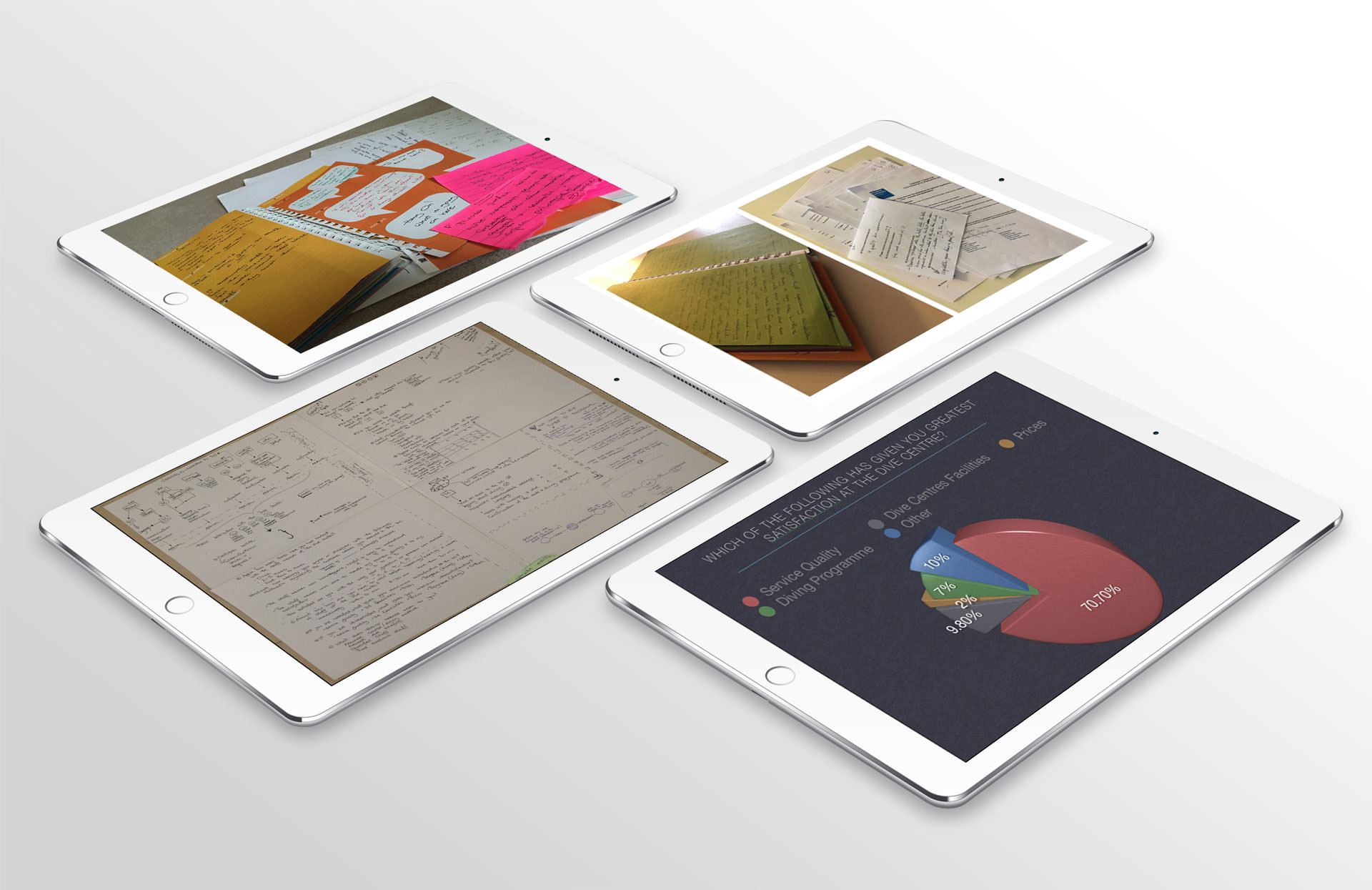
User interviews and research synthesis
Affinity mapping and insights
Key Insights
Our initial research phase revealed several critical findings that shaped the direction of the project and directly informed the creation of the service blueprint and user journey artefacts:
Critical Findings
- Staff Kindness and Professionalism: Users consistently praised the dive centre's staff for their warmth and professionalism, which fostered a strong sense of safety and community.
- Digital Experience Gaps: Despite positive in-person experiences, the digital platform did not reflect the same level of care. Users encountered inconsistencies in content, navigation, and visual design across different language versions.
- Diverse User Needs: Interviews and surveys highlighted a heterogeneous client base, each with unique expectations and preferred ways of interacting with the centre—both online and offline.
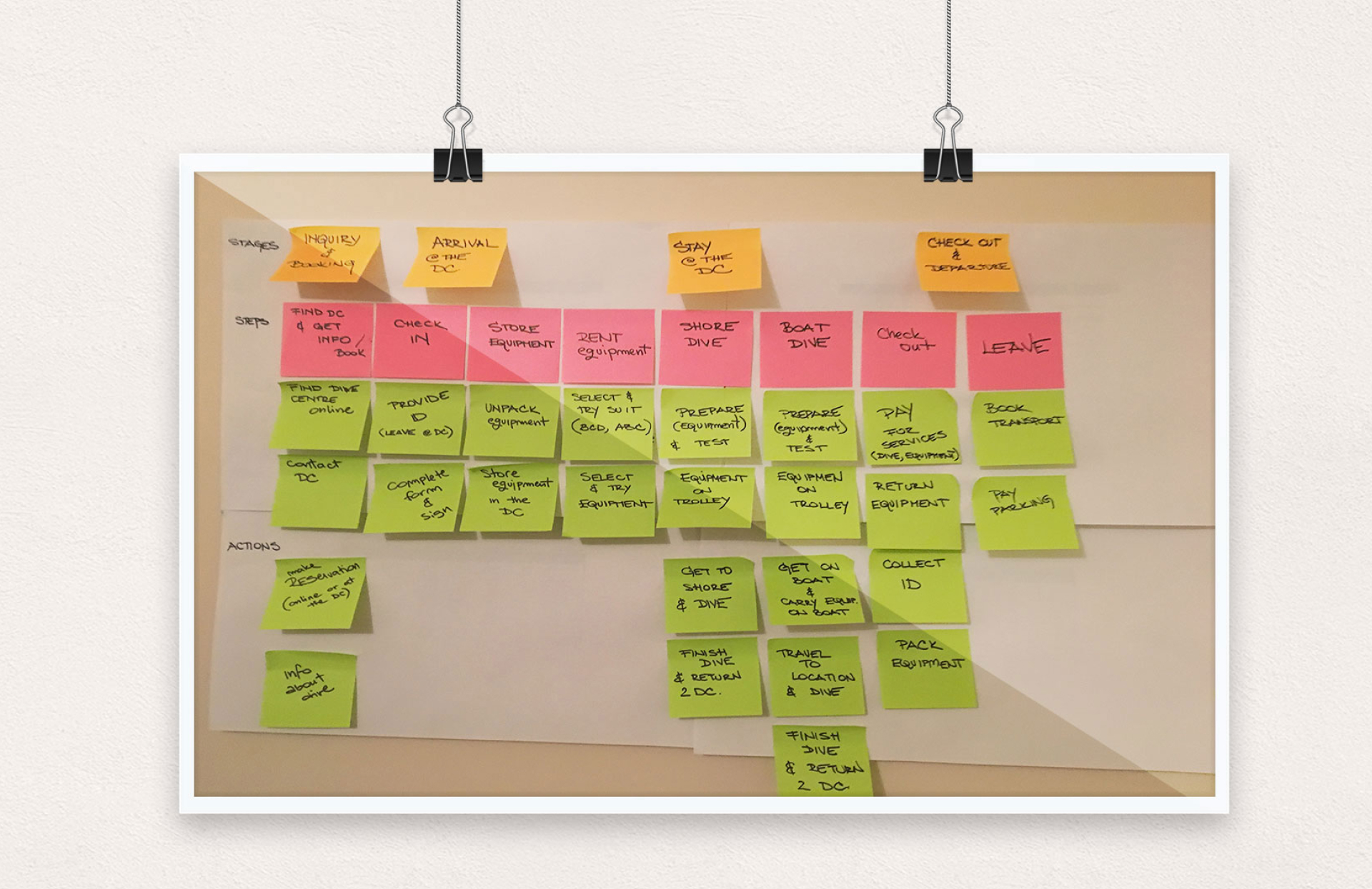
- Service Blueprint Development: Drawing on insights from 60 user interviews, stakeholder feedback, and survey data, I developed detailed service blueprints and user journey maps capturing the full customer experience.
Service Blueprint and User Journey Mapping
The blueprint and journey maps became key reference points for the design process, ensuring that the new platform addressed real user needs and delivered a seamless, welcoming experience across all touchpoints.
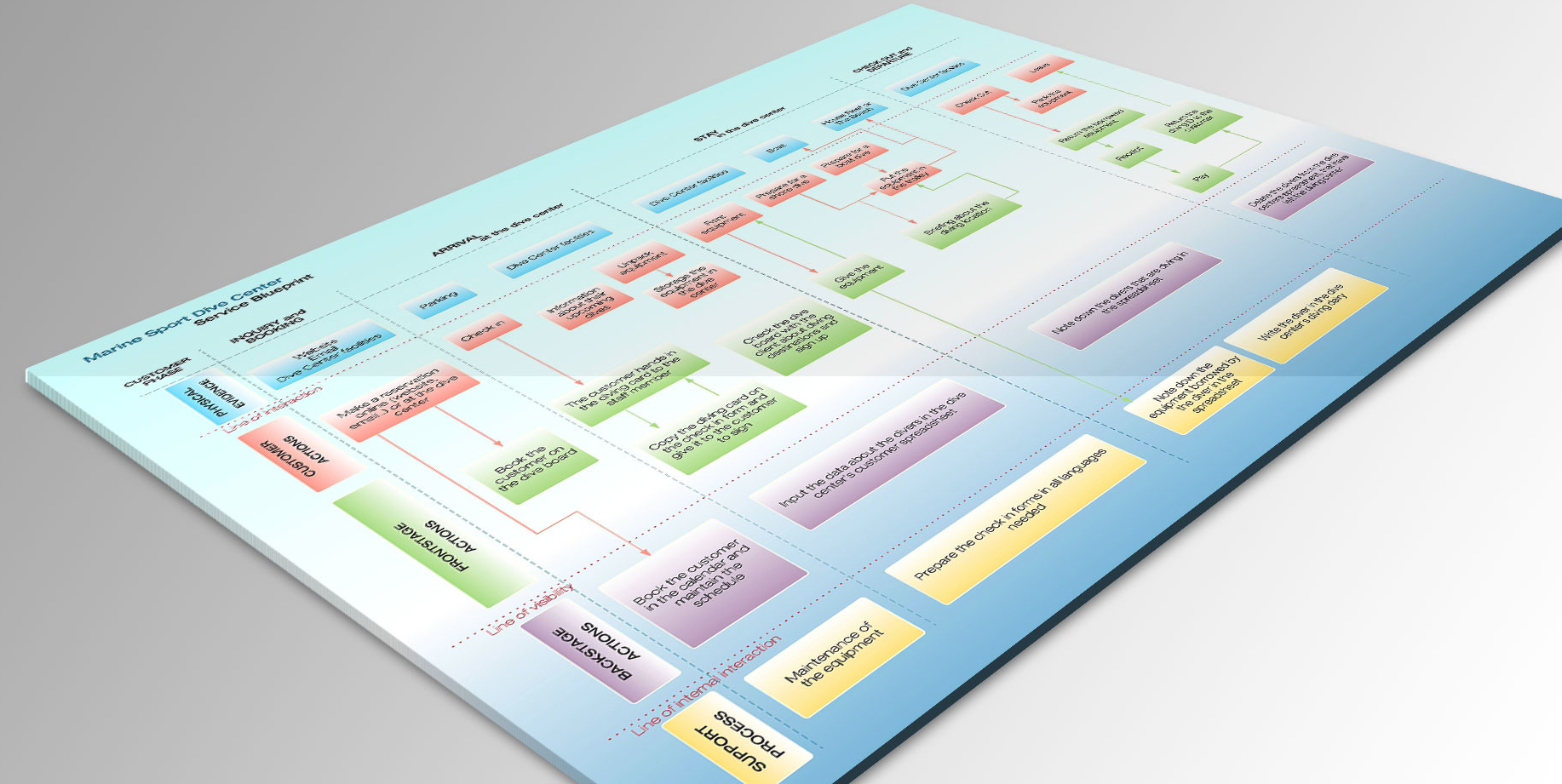
Service Blueprint
Part II: Digital Platform Audit
Building on the foundation of user and stakeholder insights, I conducted a thorough audit of the digital platform to identify specific areas for improvement.
Heuristic Evaluation
I systematically reviewed the website using established usability guidelines. This revealed inconsistencies in information architecture and navigation, mismatched link names and calls-to-action, outdated visuals, and a lack of trust-building elements.
Content and Visual Review
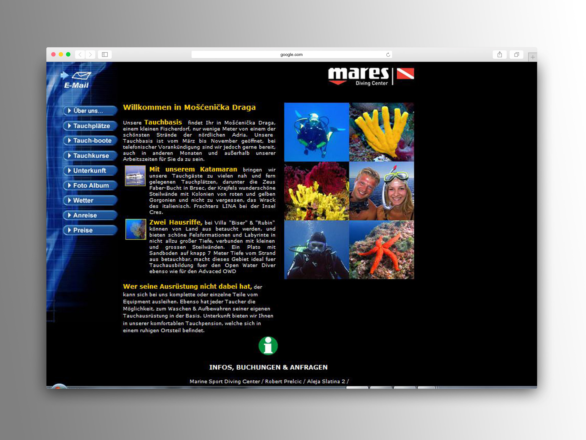
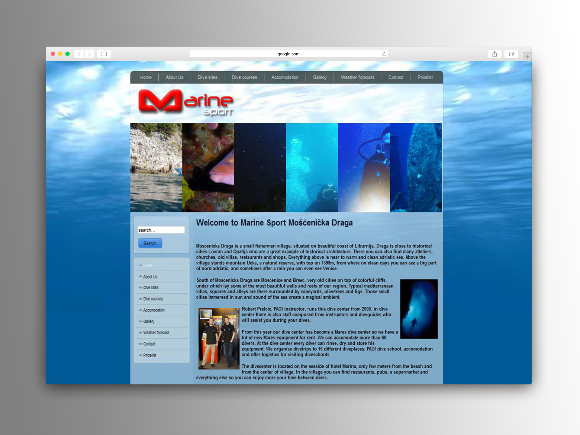
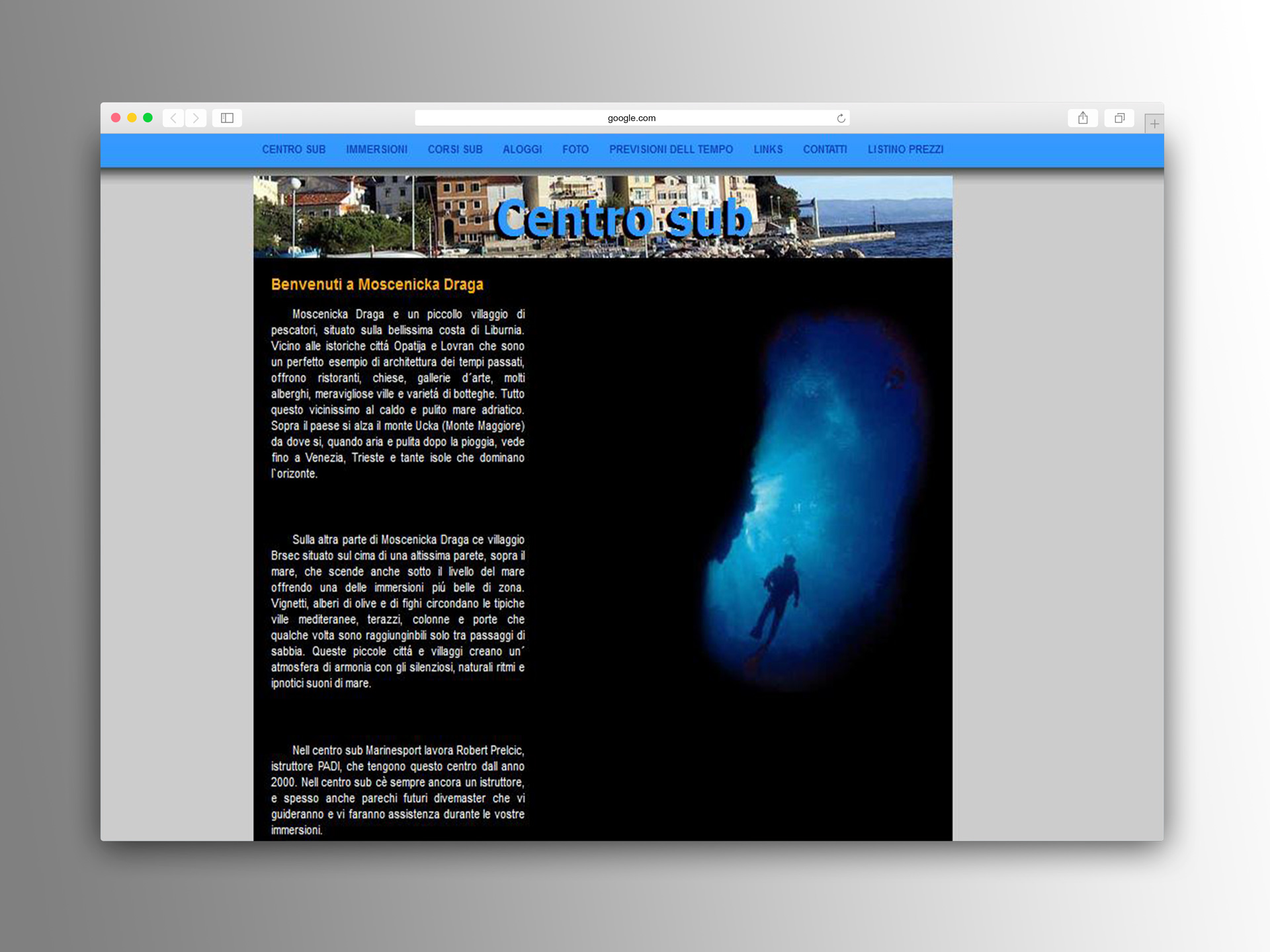
Each language version of the site had developed its own structure and style over time, resulting in a fragmented experience. Some pages contained typographical errors, outdated images, and inactive contact sections, whilst others lacked clear information about services.
To highlight these issues, I included screenshots from the German, Italian, and English sites, clearly showing the differences in layout and design across languages. These visuals made the need for a unified, modern platform immediately clear to everyone involved.
Synthesis & Strategy
I organised and analysed all qualitative data using affinity mapping and qualitative coding. This enabled me to create user personas representing the centre's diverse client base, develop service blueprints and user journeys to visualise the customer experience across all touchpoints, and identify key requirements to prioritise features that would have the greatest impact.
The strategy focused on creating a unified digital experience that matched the excellence of the in-person service, whilst addressing the specific needs of an international, multi-language audience in Croatia's competitive tourism market.
Design and Iteration
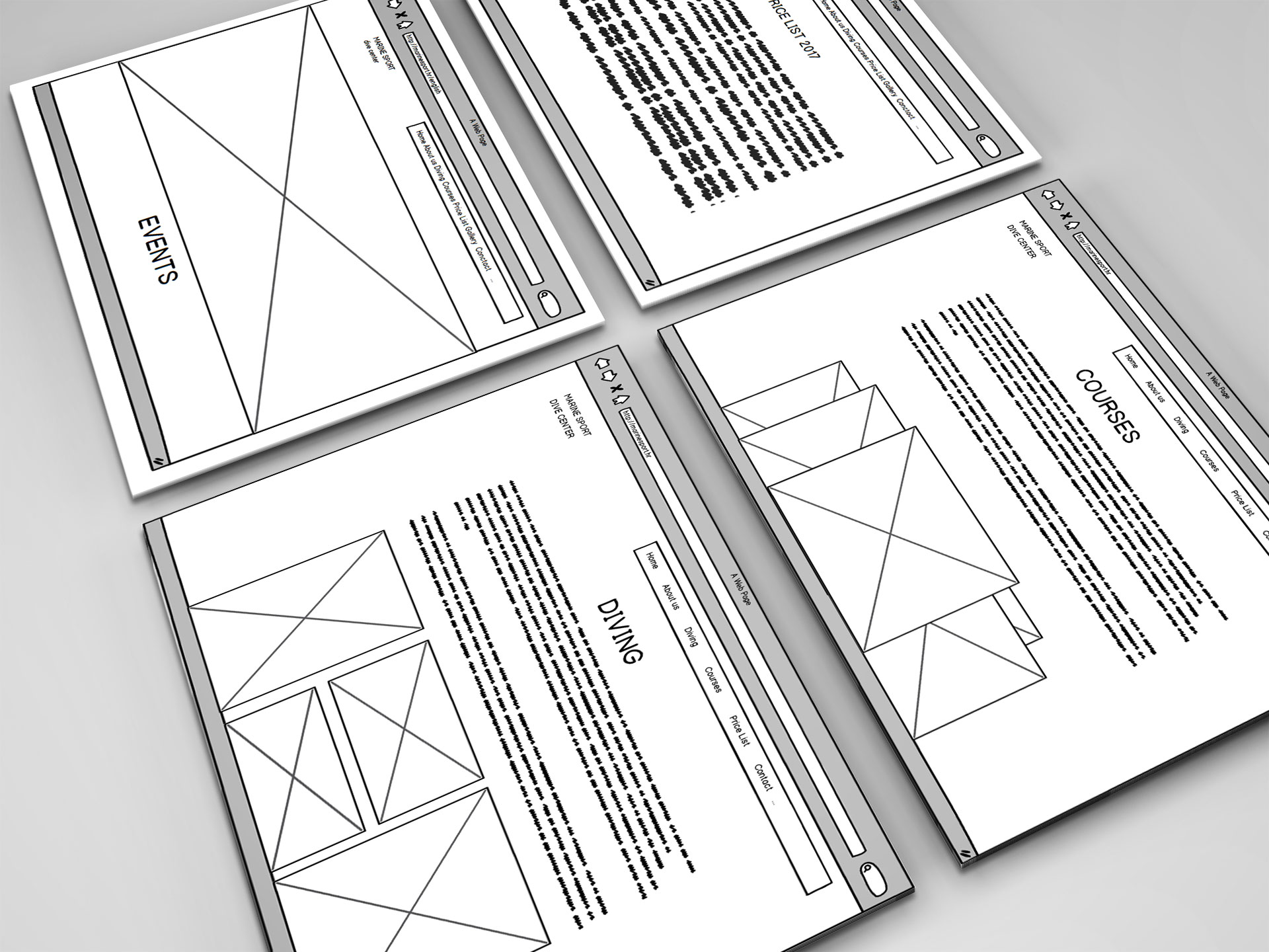
Low-Fidelity Wireframes
To kick off the redesign, I created low-fidelity wireframes for the key pages, focusing on clear navigation and information hierarchy. These sketches allowed for rapid exploration of layout ideas and were tested directly with users at the dive centre. Their feedback highlighted pain points and areas for improvement, enabling quick iteration before committing to detailed visuals.
Site Mapping
An initial site map was developed to outline the structure of the new website. This primary version represented our starting point for organising content and navigation. Through ongoing user feedback and input from the business, we identified areas for improvement—such as simplifying navigation paths and making key information more accessible.
After usability testing, the refined site map incorporated these enhancements, resulting in a more intuitive and streamlined user journey across all language versions. By comparing the two versions side by side, it's clear how user-centred iteration led to a more effective and user-friendly structure.
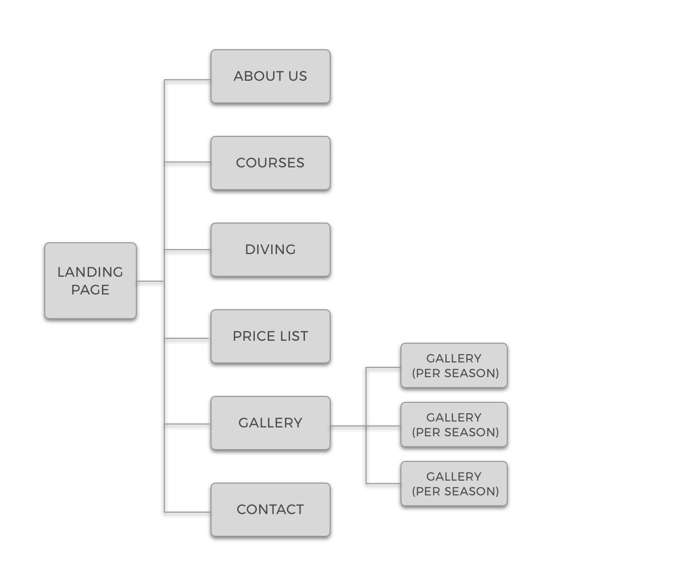
Primary site map - initial structure
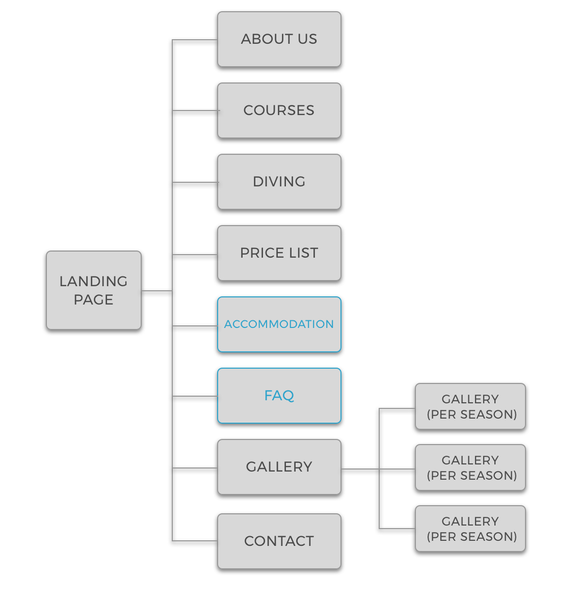
Improved site map after testing
High-Fidelity Design
With user-tested wireframes and a refined site map in place, I moved on to high-fidelity design. This stage involved developing polished page layouts, a comprehensive style guide, and a carefully chosen colour palette and typography. Regular checkpoints with users and stakeholders ensured the evolving design remained aligned with both user expectations and organisational goals.
Colour Palette
The blue colour was chosen to be the main colour of the website. Apart from blue symbolizing the sea, it also brings a calming, trustworthy and cool effect on users.
Typography
Heading
Montserrat Semi-Bold
Body
Montserrat Light
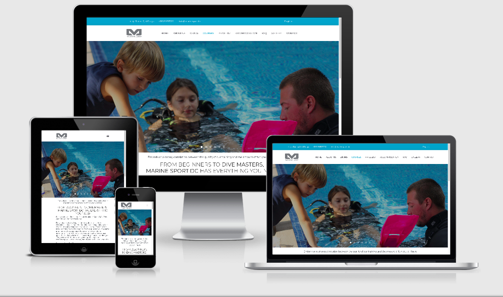
Implementation and Outcome
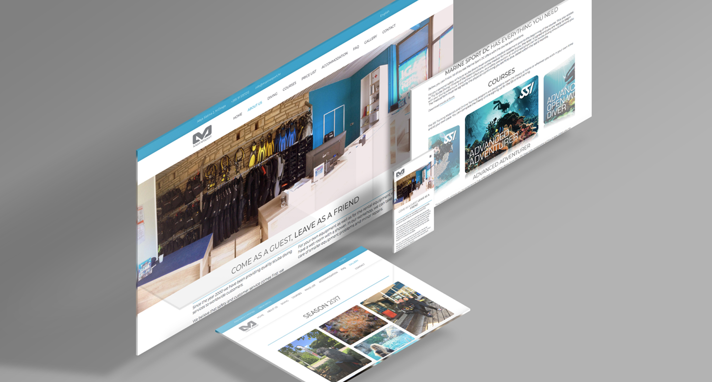
The result was a fully functional, multi-language website that now serves as a true digital gateway to the dive centre. The new platform successfully captures the warmth, professionalism, and community spirit that guests experience in person.
Key Improvements
- Unified navigation and consistent information architecture across all language versions
- The dive centre's own, visually engaging imagery and clear, accessible content
- Prominent, easy-to-use contact channels
- A cohesive visual identity that builds trust and reflects the centre's professionalism
Reflection
Leading the digital transformation of the dive centre's website was both a challenge and a rewarding experience. Working closely with stakeholders and users, I was able to deliver a platform that not only meets modern standards but also genuinely reflects the welcoming spirit and professionalism of the centre.
The process reinforced the importance of thorough research, iterative design, and clear documentation. Conducting 60 user interviews provided robust insights that shaped every design decision, whilst the service blueprint and user journey maps ensured we addressed the full customer experience—not just the digital touchpoints.
I'm proud that the new website continues to support the centre's community and helps divers connect more easily, no matter where they are in the world. The unified multi-language experience now properly represents the excellence that the dive centre delivers in person.