Vekta Group
Transforming a renewables leader's digital presence in 3 weeks
Role
Lead UX/UI Designer (Freelance)
Timeline
3 weeks (Discovery to Launch)
Overview
Vekta Group approached me to redesign their website ahead of a major industry conference. What started as a visual refresh quickly revealed deeper challenges: their digital presence didn't reflect their evolution from traditional consultancy into innovative software development and data processing for the renewables sector.
Following the website launch, I continued working with Vekta to build a comprehensive design system and component (link to page) library to support their growing digital product suite.
The Challenge
Business Context: Vekta had evolved significantly, moving beyond consultancy services into sophisticated software tools and data processing for renewable energy projects. However, their website told a different story—it looked like a standard business consultancy from 2015.
The Problem
Outdated WordPress site with broken elements and missing content. No clear separation between consultancy and software offerings. Poor information hierarchy making services difficult to discover.
The Impact
Stale content with news section not updated in years. No performance monitoring or accessibility considerations. Site didn't reflect their expertise in cutting-edge renewables technology.
Timeline Pressure
A major industry conference was 6 weeks away. We completed the full redesign in 3 weeks, launching with time to spare for final content updates before the event.
Discovery & Research
Stakeholder Engagement
I worked directly with the CEO and key stakeholders to understand both the business vision and immediate needs. This included:
In-depth interviews to identify priorities and strategic direction
Review of Edinburgh University research on renewables sector user needs
Due diligence on existing analytics (where available)
Competitive analysis within the renewables consultancy space
Comprehensive Site Audit
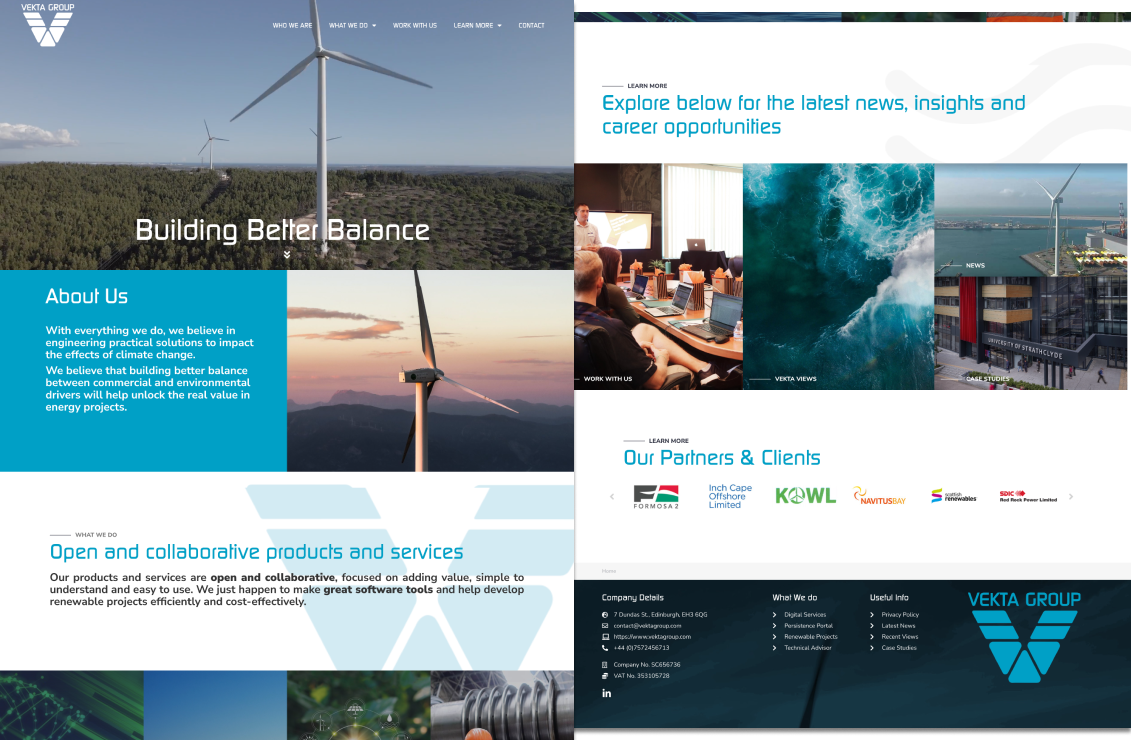
The original site—cluttered navigation, dated aesthetics, and unclear service hierarchy
I conducted a thorough audit of the existing site across multiple dimensions:
Content Audit
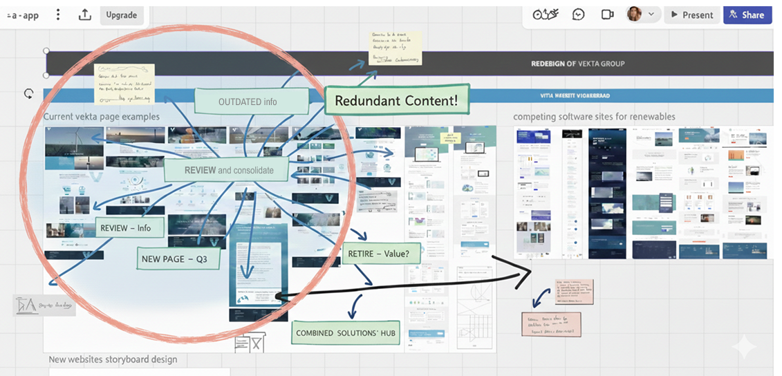
Mapping the content sprawl—every page needed review, consolidation, or retirement
Technical Performance Assessment
Using GTmetrix, I assessed the site's technical health:
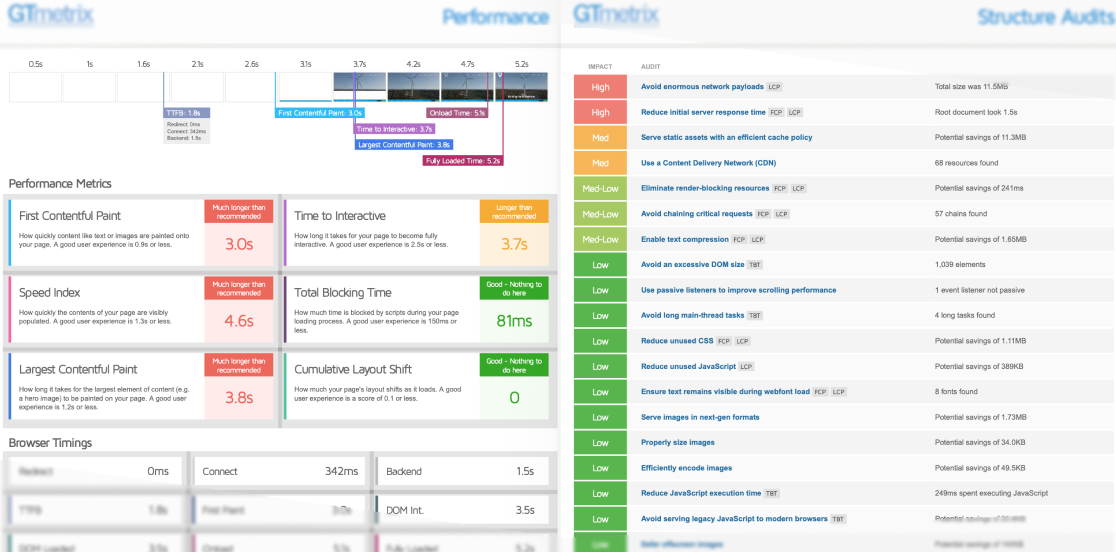
Snapshot from the GTmetrix Performance Report generated for the business (6-page PDF)
Sustainability Assessment
Given Vekta's position in renewables, I used the Website Carbon Calculator to assess environmental impact.
Key Finding
Even with renewable energy hosting, the site's inefficiency created unnecessary carbon emissions. The page was dirtier than 94% of web pages tested, producing 2.82g of CO2 per visit.
This became a key design principle—optimise not just for performance, but for sustainability.
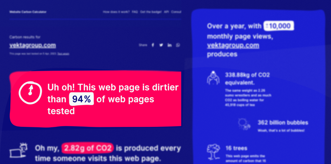
Carbon footprint assessment—higher than expected despite renewable hosting
Accessibility Gap Analysis
No WCAG compliance considerations
Poor colour contrast ratios
Lack of semantic HTML
No keyboard navigation support
Missing alt text on images
Strategic Approach
Information Architecture Overhaul
The biggest insight: visitors couldn't quickly understand what Vekta does or for whom. The site muddled consultancy services with software products, creating confusion for both audience types.
Clear service separation - Distinct pathways for consultancy clients vs software users
Improved hierarchy - Showcasing breadth of services with logical groupings
Content consolidation - 47 pages reduced to 23 focused, purposeful pages
Updated navigation - Intuitive labels guiding different user types to relevant content
Design Principles
Based on discovery findings, I established core principles that would guide all decisions:
Every page should immediately communicate value and next steps
Fast load times aren't optional in 2023
Optimise for environmental impact alongside user experience
WCAG 2.1 AA compliance minimum
Reflect innovation without losing credibility
Design Process
Rapid Prototyping
Working under tight timelines, I adopted an agile approach:
1. iPad Sketching
During stakeholder meetings, I wireframed concepts in real-time on iPad, getting immediate feedback and buy-in. This eliminated lengthy review cycles.
2. Iterative Refinement
Initial wireframes explored three-column layouts with extensive content. Through testing and stakeholder feedback, we decluttered and moved to a cleaner two-column approach.
3. Rapid Validation
Got stakeholder green light on wireframes before investing time in high-fidelity designs.
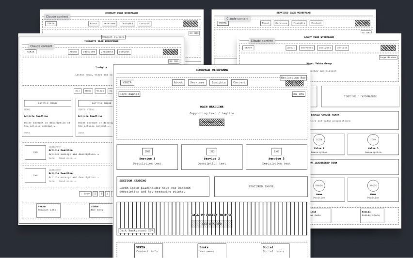
Initial wireframe explorations—sketched during stakeholder meetings for immediate feedback
Visual Design
The new visual direction needed to:
Reflect Vekta's position as an innovative renewables leader
Create trust through professional, polished design
Load quickly without sacrificing visual appeal
Work seamlessly across devices
Design System Foundation
Rather than just creating pages, I built a foundational design system including consistent grid system, modular component library, typography scale and hierarchy, accessible colour palette, and reusable UI patterns. This would enable Vekta's team to maintain consistency as the site grows.
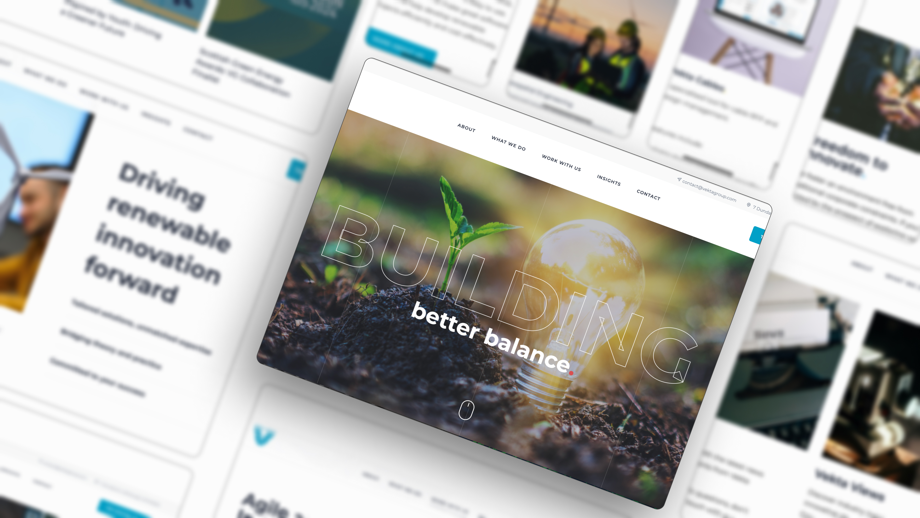
Main homepage redesign with supporting screens, focused on clarity, modernity, and sustainability
I worked through every existing page:
Rewrote copy to be clear, concise, and action-oriented
Consolidated duplicate content removing redundancy
Retired outdated information (old news, completed projects, former team members)
Restructured project showcases to highlight recent achievements
Created new service descriptions reflecting evolved capabilities
Implementation
Front-end Development & Handoff
I developed the complete front-end, then handed over the files to Vekta's development team who deployed them to their server infrastructure.
Implemented lazy loading, image optimisation (WebP format), and asset consolidation to achieve the performance targets
Built with semantic HTML, ARIA labels, keyboard navigation support, and WCAG 2.1 AA compliance throughout
Results & Impact
From 5.2s to 1.8s
From 11.5MB to 3.2MB
Per page visit
Clear Positioning
Visitors now immediately understand Vekta's dual offerings. The separation between consultancy and software services eliminated confusion and created clearer conversion pathways.
Scalable Foundation
The design system and component library enables Vekta's team to maintain visual consistency as they add content, rapidly prototype new product pages, and extend the system for their software platform.
On-Time Delivery
Site launched with 2 weeks to spare before the conference, allowing time for final tweaks and content updates. Positive stakeholder feedback on reflection of innovative capabilities.
Reflections
Discovery Drives Design
The initial audit revealed problems beyond aesthetics. Without understanding the performance issues, accessibility gaps, and IA confusion, I'd have created a pretty but still-broken site.
Sustainability Can Drive Better DesignOptimising for carbon footprint forced decisions that also improved user experience. It's not a trade-off.
Rapid Prototyping Accelerates Buy-In
Real-time wireframing in stakeholder meetings eliminated review cycles and built collaborative ownership of the solution.
Design Systems Pay Dividends
Even under time pressure, investing in a component library and grid system created long-term value beyond the initial project.